


Monk's Pub
Monk's Pub Chicago
Product Designer
Figma, Responsive Design
2024
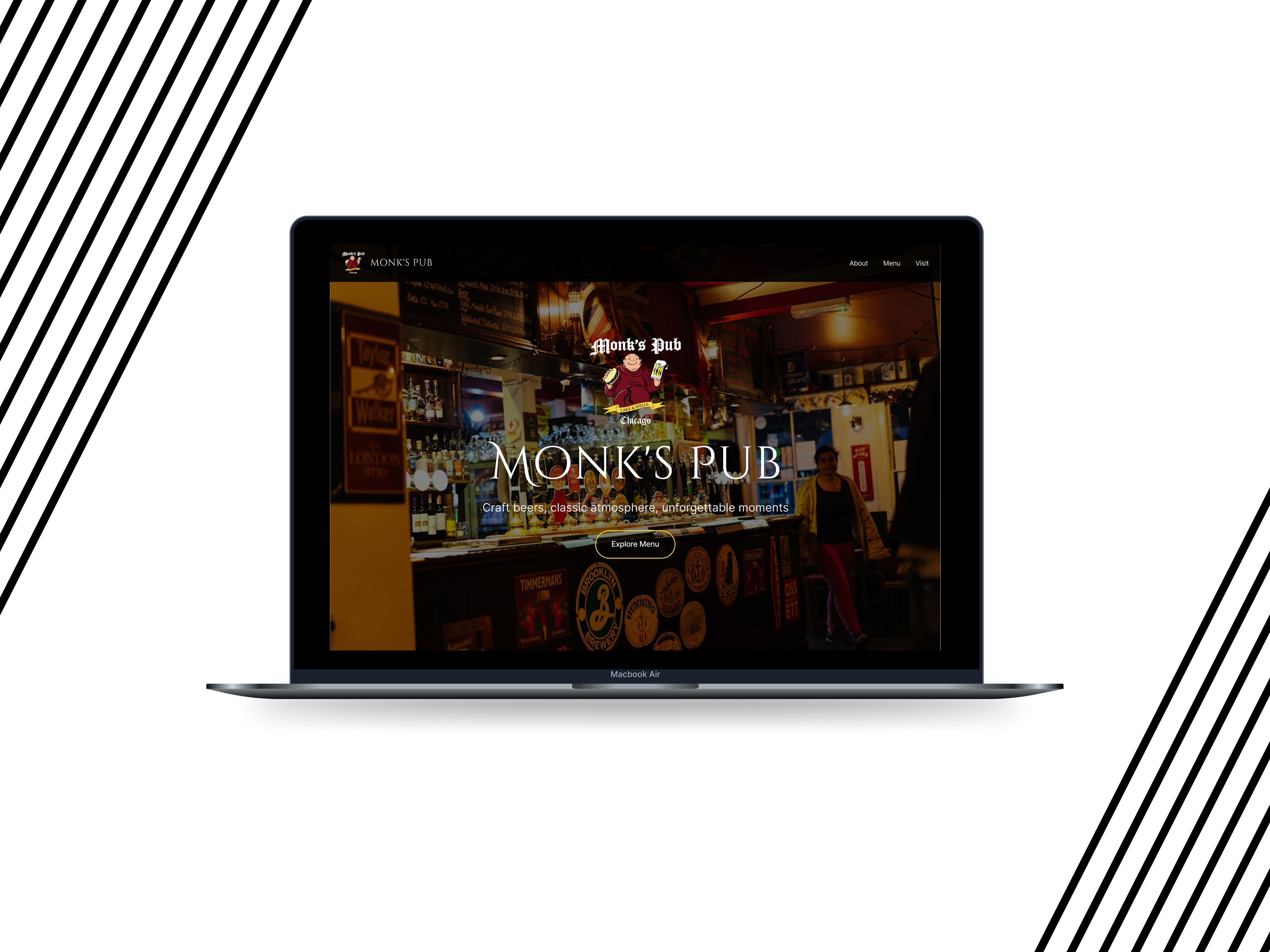
A beloved independent craft beer pub in the Loop area of Chicago.
Known for its 120+ beer selection, hearty pub fare, and classic neighborhood atmosphere, the business lacked a website that reflected its character or served its customers effectively on mobile devices.
How I redesigned Monk's Pub website to feel as welcoming as walking through their doors.
How can we create a warm, modern digital experience that captures the soul of a classic Chicago pub while making the menu and visit information effortless to access?
Research Methods
A mix of competitive review, heuristic evaluation, and pattern research grounded in Gestalt theory.
Competitive analysis
Of local Chicago pubs and craft beer websites.
Heuristic evaluation
Of the existing Monk's Pub website.
User scenario mapping
Desktop + mobile.
UI pattern research
Restaurant menus, responsive navigation.
Application of Gestalt theory and UX design principles
Affordances, signifiers, continuity.
01 — Overview
Overview
Monk's Pub is a beloved independent craft beer pub located in the Loop area of Chicago (205 W. Lake St.). Known for its 120+ beer selection, hearty pub fare, and classic neighborhood atmosphere, the business lacked a website that reflected its character or served its customers effectively on mobile devices.
01 — Overview · Problem Statement
Problem.
The existing website felt dated, visually cluttered, and difficult to navigate, especially on mobile. Users struggled to quickly browse the extensive beer menu, understand the story behind the pub, and find essential information such as hours and location. The design failed to convey the warm, inviting atmosphere that makes Monk's Pub special.
How can we design a responsive website that balances nostalgic pub warmth with modern clarity, strong visual hierarchy, and intuitive navigation?
02 — Research
Research Insights
Affordances & Signifiers
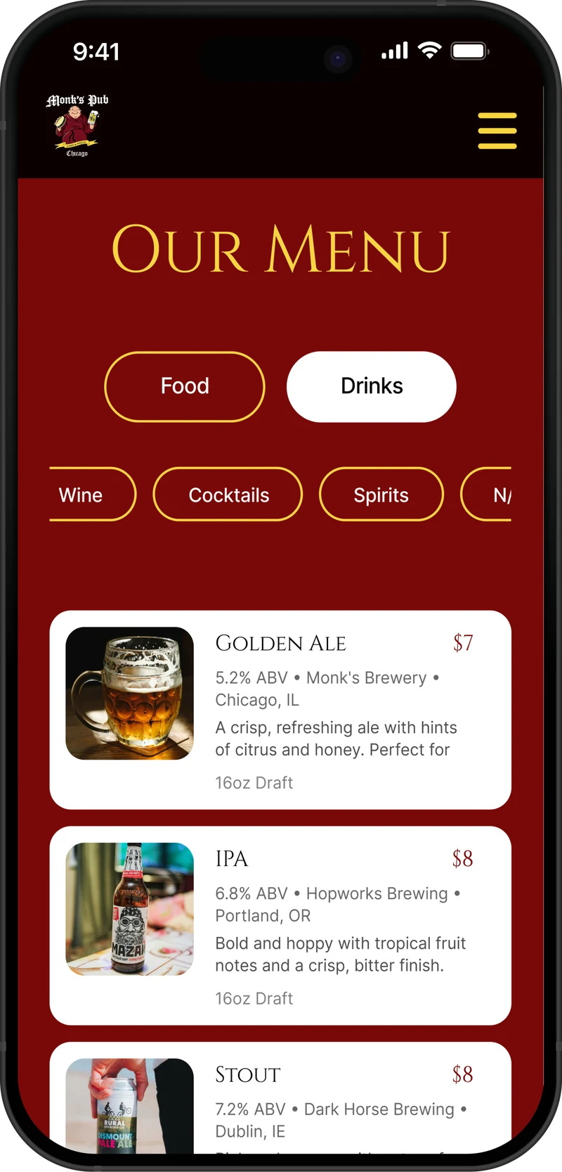
Large, high-contrast buttons and clear category tabs (Beer, Wine, Cocktails, etc.) were essential so users immediately understand what is interactive.
Visual Continuity
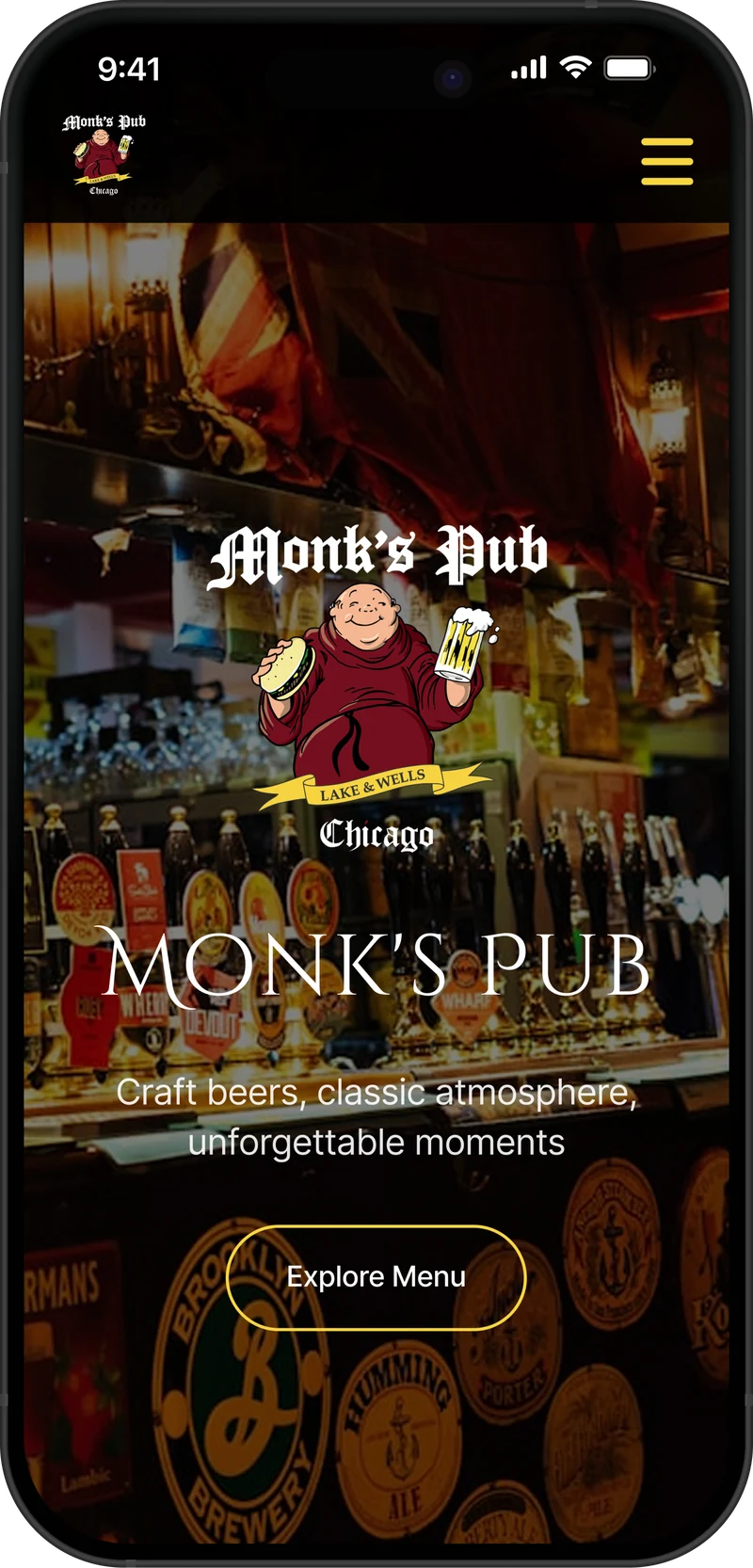
A consistent burgundy and gold color palette, warm photography, and repeated typographic hierarchy created a cohesive "pub" feel across all screen sizes.
Mobile Usability
The majority of users check menus and hours on their phones. A clean slide-out navigation drawer with large touch targets became critical.
Scanning Behavior
Menu items needed to be scannable in seconds. Large beer images, bold pricing, ABV/style tags, and short descriptions support the F-pattern and Z-pattern reading flow.
03 — Product Development
Recommendations
Recommendation 01
A desktop-first + mobile responsive layout.
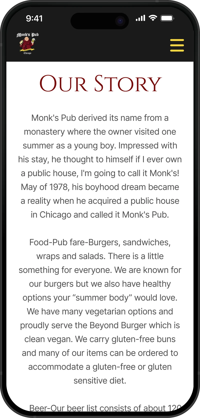
Implemented a desktop-first + mobile responsive layout with smooth section flow: Hero → Our Story → Interactive Menu → Gallery → Visit Us.
Recommendation 02
Modular beer cards.
Designed modular beer cards that stack gracefully on mobile while maintaining strong visual appeal on desktop.
Recommendation 03
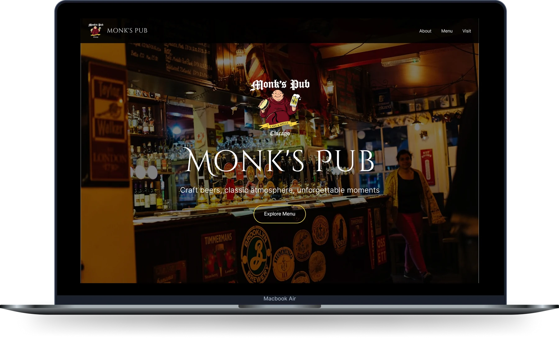
A prominent "Explore Menu" CTA.
Created a prominent "Explore Menu" CTA and clear category filters to reduce cognitive load.
Recommendation 04
Generous white space, WCAG AA contrast, 48px touch targets.
Ensured generous white space, proper contrast ratios (WCAG AA), and touch-friendly targets (minimum 48px).
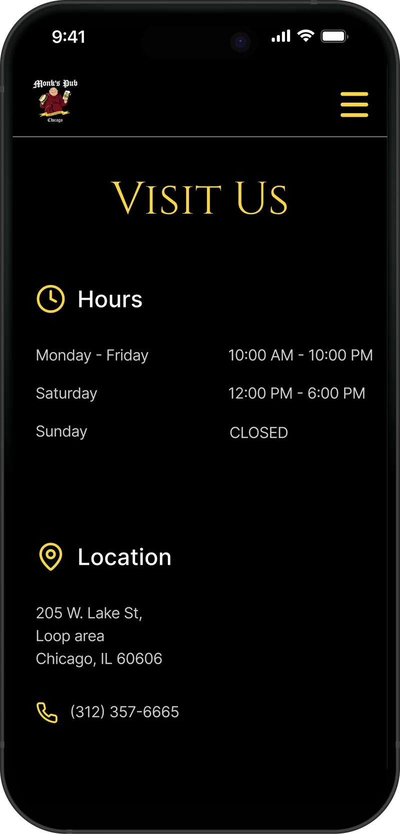
Recommendation 05
Imagery optimized for warmth and speed.
Optimized imagery for fast loading while preserving the warm, moody pub atmosphere.
04 — Results
Key Design Outcomes
The redesigned website successfully transforms a dated digital presence into a modern, inviting destination that reflects Monk's Pub's personality.
Strong visual continuity between desktop and mobile versions.
Clear affordances and signifiers that guide users intuitively through the menu and reservation flow.
Improved scannability and hierarchy for both the storytelling and the 120+ beer selection.
Professional, portfolio-ready high-fidelity mockups demonstrating responsive design principles.
05 — Closing
Thank you.
This project strengthened my ability to apply core UX/UI principles; affordances, signifiers, continuity, hierarchy, and responsive design to create emotionally resonant digital experiences for hospitality brands.
Contact — pehardamir1@gmail.com · +773-456-1671