

WeReceipt
WeReceipt (Startup)
UX & UI Product Designer
Figma, Sketch, MockFlow
2021 — 2022
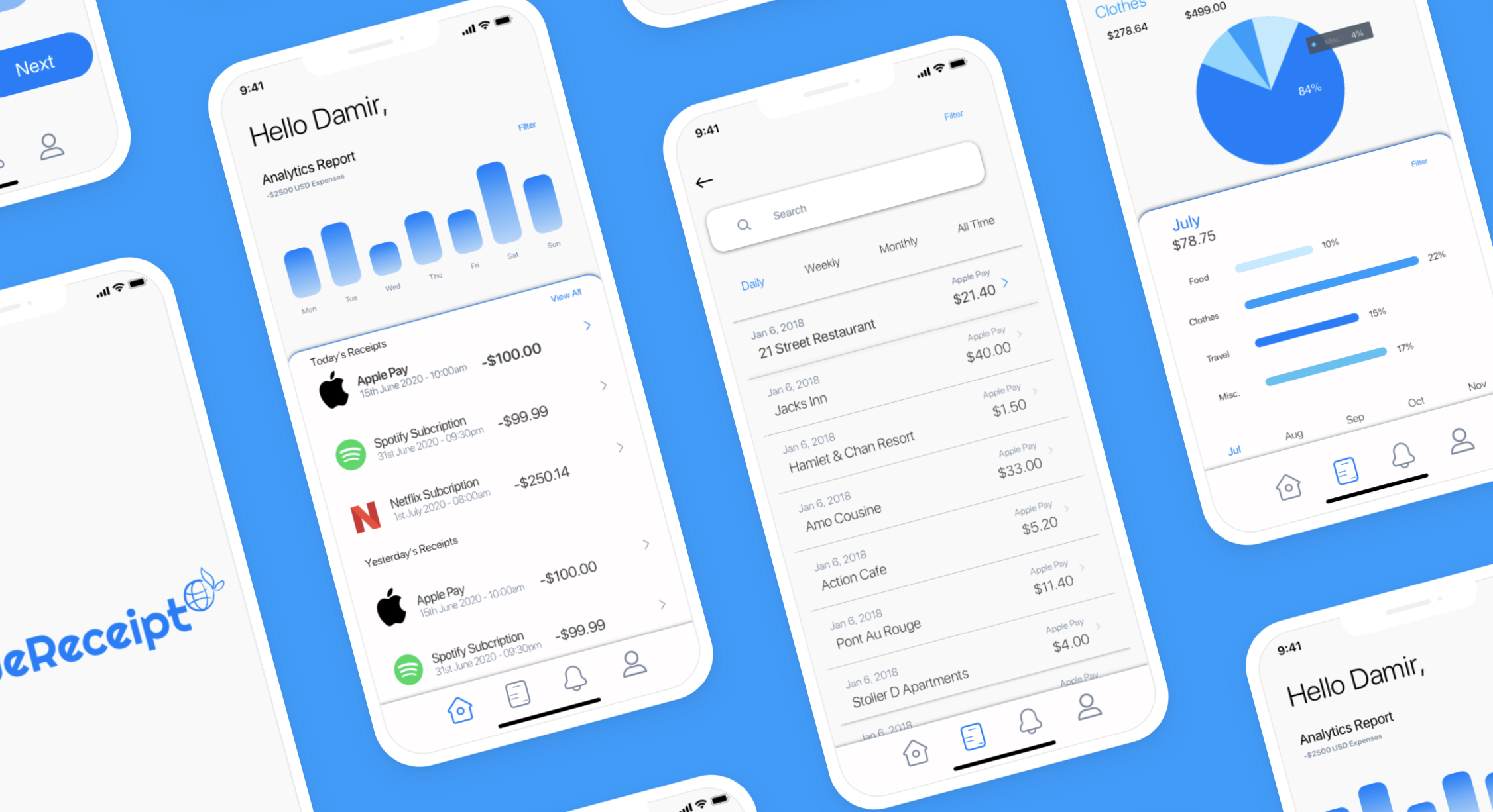
The goal was to create an intuitive, visually pleasing app.
WeReceipt is a mobile expense tracker that lets users scan receipts, automatically categorize spending, and gain clear insights into their financial habits.
How can we make tracking everyday expenses feel effortless?
A receipt-scanning app that feels intuitive, visually consistent, and rewarding to use through strong affordances, clear signifiers, and delightful feedback.
Research Methods
Heuristic evaluation, competitive analysis, and usability testing of low-fidelity prototypes.
Competitive analysis
ReceiptPal, Expensify, Mint, Google Lens.
Heuristic evaluation
Of existing receipt-tracking apps.
User flow mapping & task analysis
Mapping every screen in the existing experience before redesigning.
Wireframing + usability testing
Of low-fidelity prototypes.
Application of core design principles
Affordances, signifiers, continuity, hierarchy, feedback.
01 — Overview
Project Brief
WeReceipt is a mobile expense tracker that lets users scan receipts, automatically categorize spending, and gain clear insights into their financial habits. The goal was to create an intuitive, visually pleasing app that simplifies receipt management for everyday users who dislike manual expense logging.
01 — Overview · The Problem
Problem.
Most receipt-tracking apps feel tedious, cluttered, or overly corporate. Users abandon them because scanning is unreliable, data visualization is confusing, and the overall experience lacks delight. People needed a simple, trustworthy tool that makes expense tracking fast and insightful rather than a chore.
How can we design a receipt-scanning app that feels intuitive, visually consistent, and rewarding to use through strong affordances, clear signifiers, and delightful feedback?
02 — The Process
Research Insights
Understanding the core of the product. Before doing any ideation, I started to analyze the existing design page by page to understand the core of the product. Next, I began to research the top budgeting apps to discover similar features.
Users scan receipts on the go.
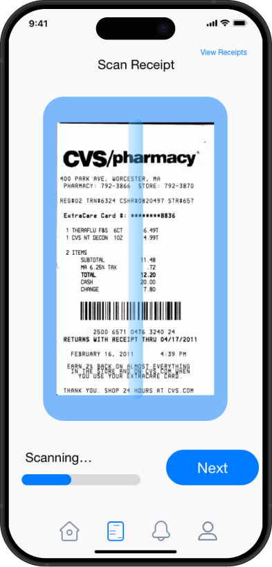
The scanner screen needed obvious affordances — large camera frame, clear "Scanning..." state, prominent Next button.
Financial data is sensitive.
Clean, trustworthy design with ample white space and calming blue tones builds confidence.
People glance at spending summaries.
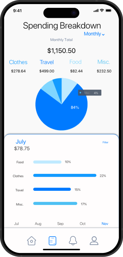
Data visualizations (pie chart + bar graphs) must be instantly scannable.
Navigation must feel familiar.
Bottom tab bar with clear icons (Home, Receipts, Analytics, Profile) acts as strong signifiers.
Continuity across screens was critical.
So users never feel lost when moving from scanning → viewing → analyzing.
02 — The Process
From sketches to flowcharts.
Ideation · Gather Ideas
Sketching and Wireframes
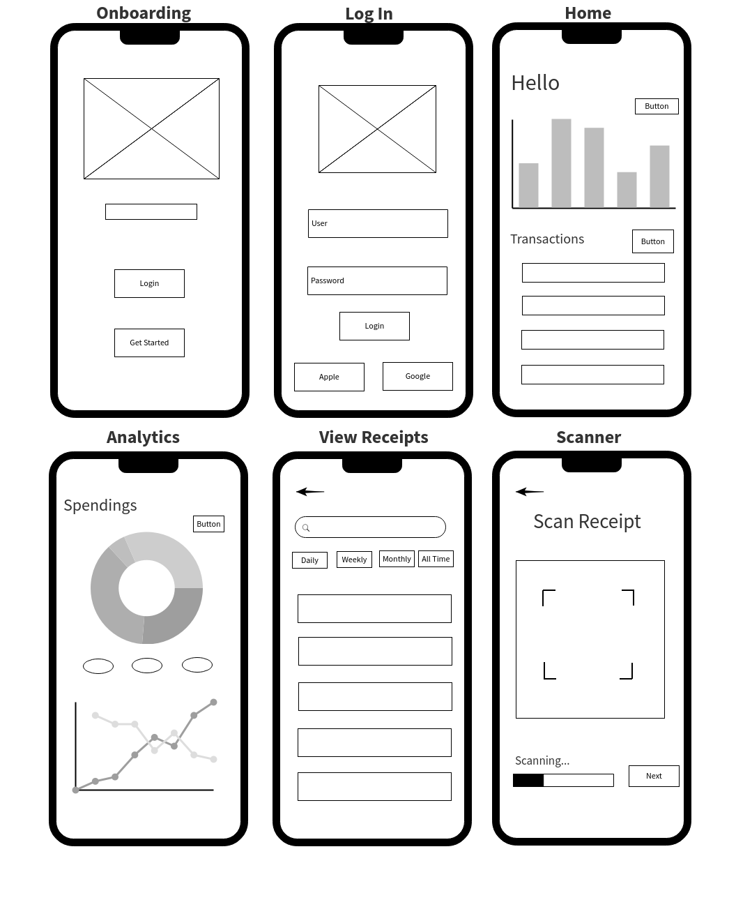
I built out simple low-fidelity wireframes with basic shapes using figma. I wanted to capture the general idea to discuss and share with team members to get feedback.
Build · General Flowchart
User Flows
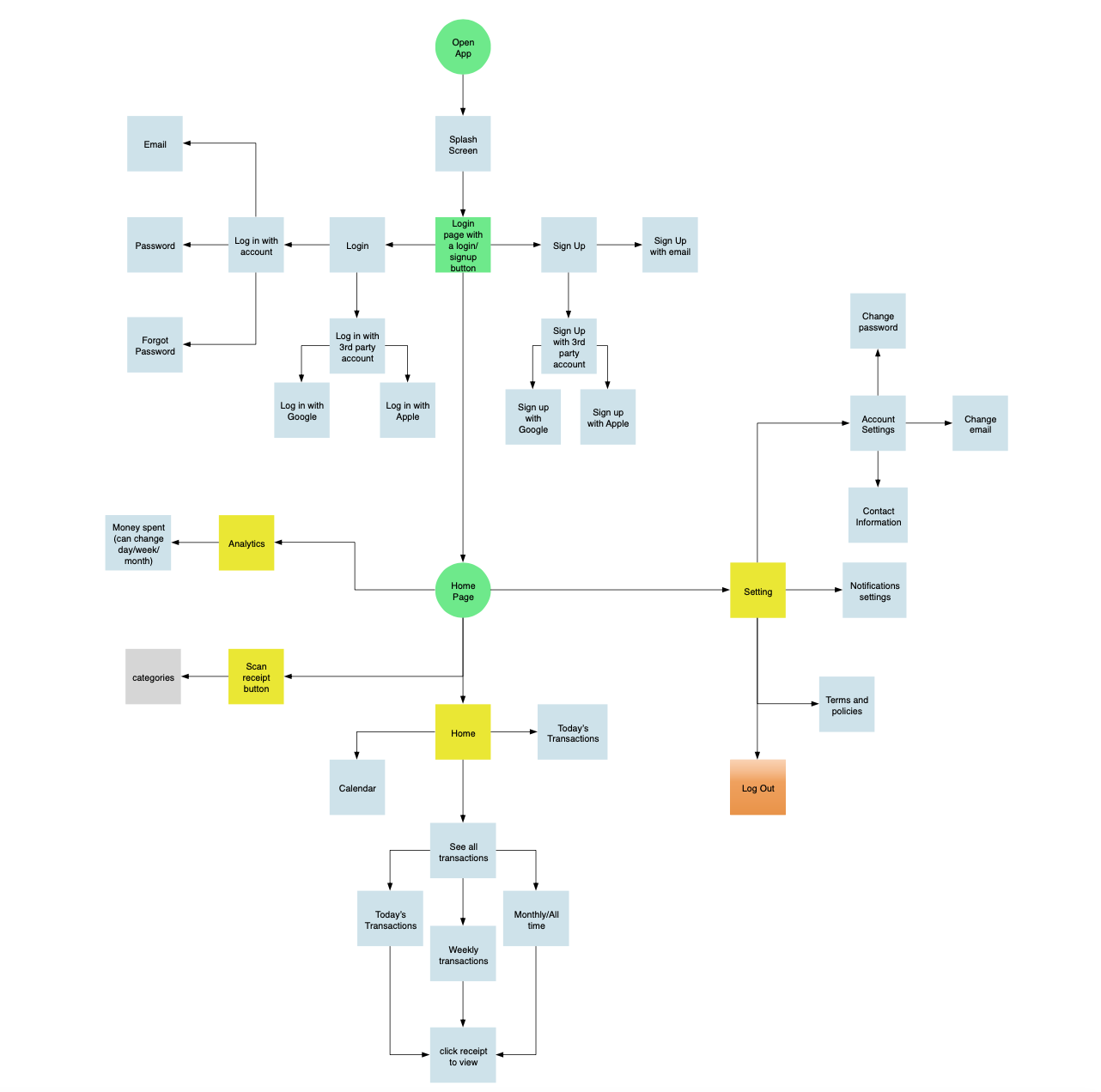
Creating UX flow helps me to understand the whole user journey and covering all the screens. Before going into user interface design, I made sure to polish the features and user interaction flow. The following feature flowcharts describe the content strategy and user flow through the app, listing potential features users may interact with. The creation of flowcharts are the basis for refining the workload necessary for developers and higher-fidelity designs later on, and for discovering potential issues behind the product in a quick and time-efficient way.
03 — Product Development
I applied several key design principles throughout the app.
Principle 01
Visual Continuity & Consistency
- A cohesive blue color system (#007AFF primary) runs throughout the app, creating a calm, financial-trustworthy feel.
- Consistent typography, card styles, and spacing maintain continuity from onboarding to analytics.
- All screens follow the same grid and alignment system for a polished, professional appearance.
Principle 02
Affordances & Signifiers
- The receipt scanner uses a prominent blue-framed camera view with corner brackets — users instantly know where to position the receipt.
- Large, high-contrast buttons ("Login", "Next", "Scan Receipt") with hover/tap feedback clearly signal interactivity.
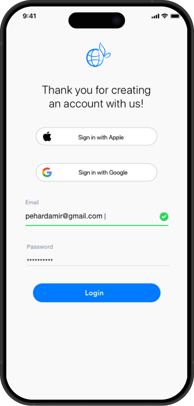
- Apple & Google sign-in buttons use familiar logos as universal signifiers for quick authentication.
Principle 03
Hierarchy & Feedback
- Spending Breakdown screen uses a large, dominant pie chart (84% Misc in the example) with clear percentage callouts.
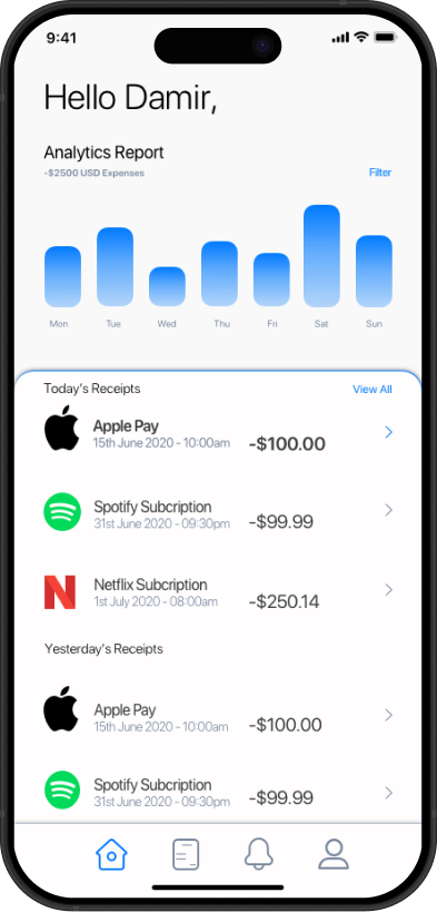
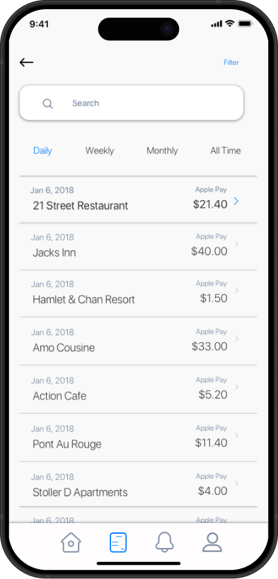
- Transaction lists show recognizable brand logos (Apple, Spotify, Netflix) as visual anchors.
- Smooth loading states ("Scanning...") and success indicators provide immediate feedback.
Principle 04
Responsive & Mobile-First Design
- All flows were designed natively for iOS with proper safe areas and thumb-friendly tap targets (minimum 44–48px).
- Wireframes were iteratively refined into high-fidelity screens.
03 — Product Development · Results
Key Design Outcomes
The final design delivers a clean, modern expense tracker that feels both functional and delightful.
Strong visual continuity across onboarding, login, home, analytics, and scanner screens.
Clear affordances and signifiers that reduce cognitive load during receipt scanning and data review.
Engaging data visualizations that make spending insights easy to understand at a glance.
Professional high-fidelity mockups and detailed user flows ready for development.
04 — What I Learned
What I have learned from this project?
Simplicity is strength.
As a designer, we are often lured by attractive, trendy and out of the box designs. But, we must always remember the 'why'. The primary goal is to understand the user, their problems, and then come up with a design that solves it.
Process is essential.
For a project that is vast, it gives you a roadmap to navigate through what can be a foggy route. This is especially useful when you're starting out.
Thanks for listening — Damir Pehar